


The Evolution of Website Design: From Static to Dynamic with Growth-Driven Design
In the ever-shifting landscape of the digital world, where user preferences change like the wind, the concept of a static website design is akin to trying to capture lightning in a bottle. Traditional web design, celebrated in its heyday for its artistic brilliance, involved creating a fixed masterpiece that aimed to embody a brand’s identity and strategy in one go. However, in a rapidly evolving digital universe, where trends warp and shift at a moment’s notice, this approach’s rigidity can hinder growth and make businesses fall behind.
Welcome to the era of Growth-Driven Design (Growth Driven Design), a paradigm shift in the world of website design that embraces dynamism, adaptability, and continuous improvement. Growth Driven Design acknowledges that perfection is not achieved in a single stroke but through an ongoing process of refinement and adaptation.
Static Web Design: The Relic of the Past
Imagine crafting a statue from unyielding stone. It’s beautiful, no doubt, but it’s incapable of adapting to changing circumstances. Similarly, traditional web design aimed to create a digital masterpiece, one that encapsulated a brand’s essence and strategy in a static form. However, the time and resources invested in this process often left businesses with a finished product that was out of touch with current market trends.
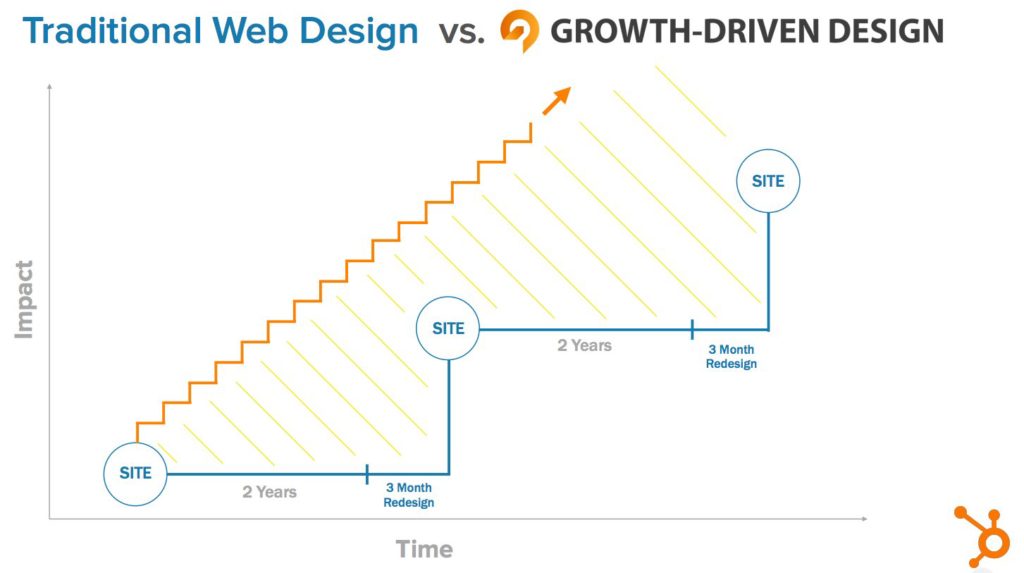
Traditional web design projects were notorious for their lengthy timelines and substantial costs. It wasn’t uncommon for months to pass before a website was ready for launch. The downside was that by the time the site went live, market conditions and user preferences had already shifted. It was as if you had crafted a painting only to find out that the art world had moved on to a new genre.
Growth Driven Design: A Paradigm Shift in Web Design
Enter Growth-Driven Design a concept pushed heavily by Hubspot. Growth Driven Web Design is a dynamic and responsive approach that flips the script on traditional web design. Growth Driven Design isn’t about creating a final product; it’s about launching a website that’s a work in progress – a “launchpad site.” This site serves as the foundation from which your online presence evolves and adapts to meet user needs and market demands.
At the core of Growth Driven Design are several principles that set it apart. First and foremost is the concept of continuous improvement. With Growth Driven Design, the launch of your website is just the beginning. It’s the starting point for gathering data, analyzing user behavior, and making informed design decisions. Instead of relying on assumptions and guesswork, Growth Driven Design embraces empirical data to drive design choices.
Additionally, Growth Driven Design places a heavy emphasis on user-centricity. Websites are no longer static entities; they are living, breathing hubs that cater to the evolving needs and preferences of users. This user-centric approach ensures that your website remains relevant, engaging, and valuable to your audience.
The Nuts and Bolts: How Growth Driven Design Works
Growth Driven Design operates on a series of well-defined steps, each contributing to the website’s dynamic evolution. The journey begins with strategy. Unlike traditional design, where everything is planned upfront, Growth Driven Design starts with a strategy to identify the core elements and goals of the website. It’s like sketching the outlines of a masterpiece before diving into the details.
Next comes the creation of the launchpad site. Instead of waiting months for a fully polished website, you launch an initial version that’s functional and user-friendly but far from complete. This approach not only reduces time-to-launch but also allows you to start gathering data and feedback from real users sooner.
But the real magic of Growth Driven Design lies in the continuous improvement phase. Here, data analysis takes center stage. You closely monitor user interactions, track key metrics, and listen to user feedback. This treasure trove of information guides the iterative design process. For instance, if you notice that users are frequently clicking a particular call-to-action button, you can experiment with different designs to optimize its effectiveness.
Enhancing the Iterative Process: A/B Testing and Micro Testing
To refine your website further, Growth Driven Design seamlessly integrates A/B testing and micro testing into the continuous improvement phase. A/B testing, a data-driven strategy, involves comparing two versions of a webpage or an element, such as a call-to-action button, to determine which resonates more with your audience. For example, you can A/B test different product images to identify the one that drives higher conversions.
Micro testing complements A/B testing by focusing on smaller-scale elements and changes. While A/B testing compares major variations, micro testing hones in on nuanced details. You can use micro testing to optimize individual elements like headlines, colors, or form fields. Together, A/B testing and micro testing ensure that every aspect of your website undergoes meticulous scrutiny and improvement.
Unlocking Growth-Driven Benefits: Real-Life Success Stories
To fully appreciate the transformative power of Growth Driven Design, it’s beneficial to explore real-life success stories of businesses that have embraced this dynamic approach. These stories showcase how Growth Driven Design can translate into tangible growth, improved user experiences, increased engagement, and higher conversions.
Take, for instance, a mid-sized e-commerce company that adopted Growth Driven Design principles. Their initial launchpad site focused on core product categories and simplified navigation. Through continuous improvement driven by data analysis, they discovered that users were responding favorably to a specific product recommendation feature. By emphasizing this feature and making it more prominent, they saw a significant uptick in sales and customer retention.
In another case, a B2B software company used Growth Driven Design to optimize their lead generation process. They experimented with different landing page layouts, form placements, and messaging. Through A/B testing and micro testing, they identified the ideal combination that generated a 30% increase in lead submissions within a few months.
Embracing the Evolution of Web Design
In a digital world characterized by rapid shifts and constant evolution, traditional web design stands as a relic of the past. Websites are no longer static entities frozen in time; they are dynamic hubs that must adapt and grow to remain relevant. Growth Driven Design represents a paradigm shift in web design philosophy, where data, user-centricity, and continuous improvement reign supreme.
As you consider the evolution of your own website, think beyond the confines of traditional design. Embrace the dynamic and transformative potential of Growth Driven Design. Launch your website as a launchpad, not a finished product. Let data and user feedback guide your design choices. Witness your website’s transformation into a living, breathing entity that evolves with the needs and preferences of your audience.
In the digital frontier, the journey is not about reaching a static destination; it’s about navigating the uncharted waters with the wisdom of Growth Driven Design as your guiding star. Embrace the evolution, and watch your website thrive in a world that demands nothing less than dynamic excellence.
